
Dental Status
An application to create and maintain patient's dental records, with real-time marking.
An easy record creation and retrieval system, with easy search and update options.
OVERVIEW
User Research, Prototyping, Interaction Design, UI and Testing.
ROLE
UX Designer
Background
Dental Status is an application developed by Tieto. A leader in the field of healthcare.
I joined Tieto as a UX designer and went to Finland for 3 months to gather requirements and conduct user research. I handled this project end to end, starting from requirements up to the end product.
Some key factors about my role in Tieto:
Implemented a design process. The team didn't have a process in place and I structured our efforts which helped in organizing and planning.
Worked end-to-end. I started with user research, and requirement gathering and went all the way up to product release.
Designed all the UI elements. All the resources such as icons and illustrations, the whole color scheme and the complete User Interface.
Collaborated with engineers and architects. The UX design was going in parallel with code architecture and design and I coordinated with all the stakeholders.
The process is simple, the standard UX design process. But some modifications are made on the iterating paths. As the testing was going to reveal new issues, which basically leads to new discoveries.

Understanding the problem
Tieto is a leader in Healthcare industry and the company wanted to design and develop a solution targeted specifically to dentists and dental hospitals.
A team was put together which comprised of software engineers, architects, and me the UX designer.
We went to Finland and conducted thorough research, including interviews with our primary users (dentists) to uncover their need and understand their pain points in the existing system.
Key points about my work:
Interviews, hospital visits, and talking to the admin staff.
Discovering pain points in the existing system and gaining an understanding of the workflow.
Collaborating with BO, and project manager to come up with a plan of action.
Preparing the requirement document along with BO.
After noting down the pain points, the basic features and gaining an overall understanding of the system, we conducted a collaborative sorting (affinity mapping) with my teammates, including managers to categorize and group the features and the project plan.


The design challenge

Key realizations
There was an existing system in place that was used by the dentists. This was a legacy system with lots of hurdles in the workflow.
Users were frustrated with filling out forms, configuration wizards, and a UI that didn't work.
Important statistics:
65% of the users were frustrated with the unyielding existing system.
48% of users found data editing and form UI tedious and non-intuitive (A text-based marking system).
Real-time marking was difficult as the graphics were incapable of handling such speed.
29% of users found that it was difficult to correct mistakes in real-time.
30% of users felt the workflow didn't mimic their practical use case.
Two very interesting design challenges we faced were:
How to show real-life metaphors?
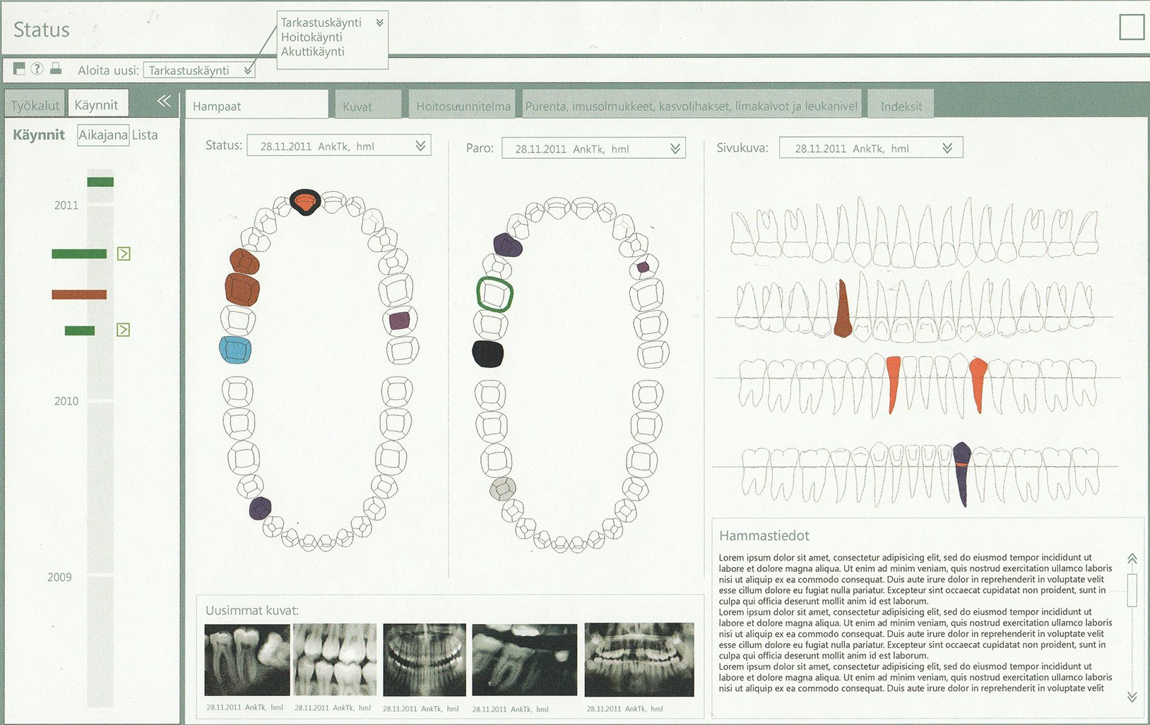
The visualization of the actual markings on the teeth.
In the existing system, every tooth was assigned a number, every surface was assigned a letter and a text-based dialog would register marking against each tooth.
We conducted our research, went through the related medical textbooks, and conducted interviews.
Some visualizations we found in the books and dentists' reference material:


The solution was clear to me. Convert the text-based system to a visual marking method.
Sketching ideas on how to represent the teeth and mark them:

We started designing how the markings can be represented visually. How they can look different enough to be distinguished and also follow the Dental textbook norms.

Starting with Wireframing
Based on the major pain points and what was desired by the users I came up with some solutions and started a very basic wireframe model.
Some of the major pain points to be addressed with these solutions were:
Show basic and important items on a single page.
Provide important functionality in the form of tabs for easy switching.
Simple UI to keep it clean and fast.
Correct workflow so that user can navigate according to their day-to-day practice.
Provide a proper visual hierarchy.


Validating & Testing prototypes
We conducted user testing by showing the primary users the prototype and gave them workflows to see if they understood the flow. I observed their behavior with the UI and if they were able to understand the structure and navigation.
We observed how they interacted with the system and their overall feeling as they walked through it.
The testing revealed that they felt comfortable with the design and understood the flow without any guidance. The prototype showed only what was necessary 80% of the time and 20% was hidden away in the admin section.


Design and development
This is a standalone application so after designing the solution in Adobe Illustrator, creating all the visual resources such as icons, illustrations, etc., I designed the entire UI in WPF (Windows Presentation Foundation).
I used Expression Blend for the design and UI resource building.
I also did the front-end development with WPF + C# combination and worked closely with architects and other engineers to help guide them with the user flow and the entire development cycle.
The product was a great success and is widely used by dentists in both Finland and Sweden.
Currently, this has become part of the bigger industry solution that Tieto offers as a complete healthcare solution package.


Some key factors about my role in Tieto
Implemented a design process. The team didn't have a process in place and I structured our efforts which helped in organizing and planning.
Contributed end-to-end. I started with user research, requirement gathering and went all the way up to product release.
Designed all the UI elements. All the resources such as icons, illustrations, color scheme and the complete User Interface.
Collaborated with engineers and architects. The UX design process was working in parallel with code architecture design and I coordinated with all the stakeholders.