Carina

Project Overview

Role : Lead UX Designer ( Researcher | Designer | Tester)
This versatile platform offers real-time charts, technical indicators and customizable charts. It also provides customizable alerts for price movements and the ability to place and manage orders directly from the platform.
Background:
Wells Fargo is one of the top banks of the USA and they have a user base of millions. They are a financial institution and a large part of their banking operations is in trading.
As part of a design overhaul a new trading platform was being designed and developed and I was hired as a Lead UX designer to aid in this process.
Some major hurdles in the project:
A challenging deadline. The team was given one month to come up with a solution.
Demographical circumstances . All the traders, our primary users are in the US. Not possible to meet them personally.
Existing solution. A product was already in use and that posed some interesting problems.
Objective:
Carina is a trading platform for in-house traders of Wells Fargo.
It is a data intensive application with real time market implications created for traders and for any other team willing to host their data on this application. The objective is to create a seamless and efficient user experience that empowers users to make informed investment decisions by delivering real-time, accurate, and actionable market insights and a customizable UI.
Target Audience:
Internal traders within the organization.
The Design Process

The standard design process follows the RESEARCH->DEFINE->IDEATE->PROTOTYPE->TEST pattern as shown in the figure above. In this project I had to modify the process to suit the situation better. Due to the limited access to the traders, my research and test phase relied on the liaison. Research and the results were executed through extensive surveys.

EMPATHISE
Sometimes, the most influential thing we can do is listen
- Bob Burg

You need to put yourself in your user’s shoes to understand their mindset, to understand where they are coming from, what matters to them!
Empathize is design thinking’s first stage for a reason. It’s the first step on the road to thoughtfully designed products that prove the designers built with a compassionate eye for their users. To empathize is to research. So, you should constantly remind yourself to question everything you observe instead of judging.
Research plan + Interviews


Research has to be tailored according to the situation every project presents, and every project is unique. The goal always is to get to the root of the problem, to understand what users need compared to what they want! Often users will tell you what they think they want in the solution, but as a researcher, it is your job to read between the lines, identify the root of the problem, and discover what users are actually looking for.
For this application I encountered a unique situation: no direct access to users. Everything was managed by a liaison who was coordinating between the USA and India. So without any direct user interviews, I resorted to the next best thing: surveys. I created a comprehensive survey and collected user opinions and feedback through tools such as Qualitrics.
Personas


John Spencer
New York, USA


Options Trader
Single

Goals
Maximize profit through strategic buying and selling of stocks.
Maintain a high accuracy rate in predictions to minimize risk and losses.
Stay ahead of market trends by utilizing data-driven insights.
Bio
John is an avid reader, loves to jog, and is a regular at the gym. He aspires to be the best trader in his organization and achieve financial independence. He spends most of his time reading and learning about fintech and how technology can help him succeed in life and in career.
Frustrations
High pressure to deliver consistent results amidst volatile markets.
Information overload from dealing with large volumes of data which can lead to decision fatigue.
Tech Knowledge

My user persona distilled all the information from my desk research and user survey responses. By generating a user persona that I felt would be the best candidate to create the solution for. The persona helped in moving the project forward during the design and testing phases.
Continually cross-referencing this document ensures my design meets the parameters for our outlined project brief.
Based on my user surveys I know two important findings: one, the user’s motivations and two the user’s needs. This information is pivotal to creating the user persona and for the project at large.

Key Findings

“The platform should be intuitive, but it shouldn’t be dumbed down. I need advanced features, but they should be easy to access.”

“I need a platform that offers a wide range of customizable charts and technical indicators. Being able to quickly identify trends and patterns is key.”
A fast, reliable and robust system, which has multiple windows, which can present fast-moving data, is highly customizable and secure.
Multiple windows showing charts and tabes.
Fast-moving data.
Customizable UI.
Secure.
Similar to Microsoft Excel.

IDEATE
Design is the intermediary between information and understanding.”
- Hans Hofmann

Ideate is where you try a verity of design options, brainstorm. The divergent part of the double diamond design process. In this case I had time constraints and a tight deadline, so I chose to try rapid prototyping approach.
Wireframes
Due to the time constraints, I came up with some ideas which were quickly converted to prototypes which helped me understand the challenges and what users wanted from the solution.


DEVELOP
“Software isn’t about methodologies, languages, or even operating systems. It is about working applications.”
-Christopher Baus

I created the design using Expression Blend and I worked on developing the UI in WPF.
I coordinated across teams and the BO in the US to bring about the solution and make sure there are no gaps between our key objectives and the final solution.


The Twist
A literary device that changes the direction of a story's plot or outcome in an unexpected way

Twist in the story and a wrench in the plan! A product decision was made to port this application to web. A new design was needed, a design that would work on the web and provides some mobility features.
New feature requests:
Every component in it’s own window. Traders wanted to move around a component to any part of the multi-screen setup.
Ability to see recent &/or favorite components. Some components were used repeatedly and those to be shown in a separate section for quick access.
Easy transition between devices. The workspace should be compatible with any screen resolution.


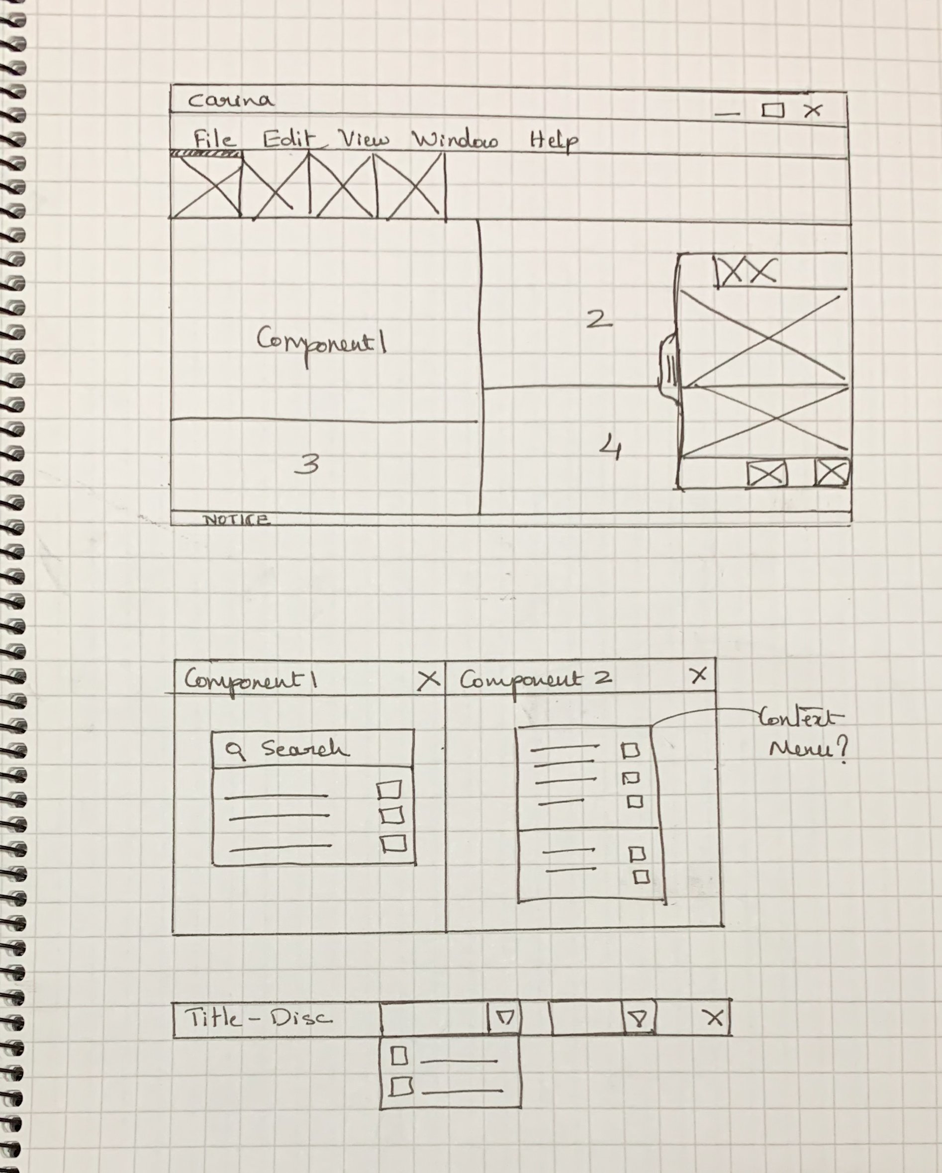
The Designs


The Design Challenge
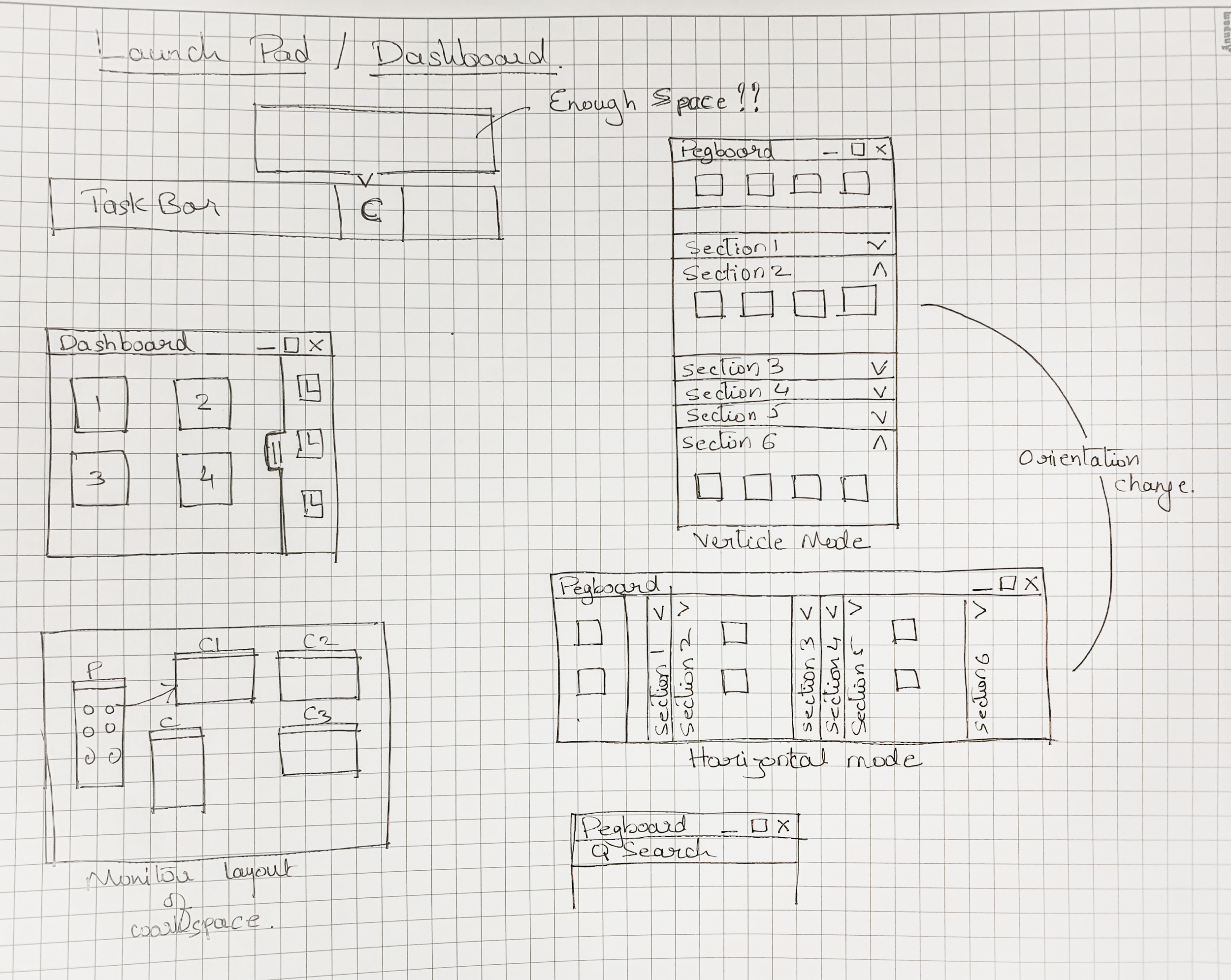
The challenge was: "From where do we launch these windows !?"
In the desktop application, the entire window provides a playground. But in web there has to be a launch pad from where new components can be launched.
Some initial thoughts were to have a tray from where users could launch items, a Pegboard of sorts.
Some sketches of the new design:

USER TESTING RESULTS
Design isn't finished until somebody is using it.

I built surveys with objective (on the scale of 1-5) type questions and also task-specific questions. Some tasks can be measured objectively and some task flows need to be understood in depth. User testing reveals how users received your design and it answers a few critical questions:
Identifies areas where users struggle or get confused.
Reveals unexpected problems that designers might not have foreseen.
Helps pinpoint specific design flaws that hinder user experience.

Daily Trade Volume


Task 1: Navigating the Main Screen
The search bar was easy to find and locate specific stocks or assets quickly.
The main screen layout was visually appealing and easy to understand. It was well-organized and didn't overwhelm me with information.
Switching between different asset classes was straightforward and efficient.
Task 2: Placing an Order
The order types and their definitions were clear and concise.
The order confirmation process was straightforward and reliable. It provided clear confirmation messages and allowed for easy modification or cancellation of orders.
I encountered no issues with order execution speed or accuracy. Orders were executed promptly and correctly.
Task 3: Using Charting Tools
The charting tools were highly customizable, offering a wide range of chart types, timeframes, and technical indicators.
Adding and removing technical indicators was simple and intuitive.
The charting tools provided real-time data updates, ensuring that I had the latest market information.
The drawing tools were effective for technical analysis, allowing me to identify patterns and trends.
General Feedback
The application was highly responsive and handled large data sets without any significant lag.
I would have liked to see more advanced order types, such as bracket orders and OCO orders.
I did not encounter any bugs or errors during the testing process.
The level of support and documentation was adequate.
Overall, the application's performance and usability were impressive. It provided a seamless trading experience.

Business Impact
$80M USD jump in daily trading volume