Carina
Carina is a trading platform for in-house traders of Wells Fargo.
It is a data intensive application with real time market implications created for traders and for any other team willing to host their data on this application.
OVERVIEW
User Research, Prototyping, Interaction Design, UI and Testing.
ROLE
UX Designer
Understanding the problem
The challenges of this project were unique and as I had no direct access to our primary users, I did the next best thing:
Brainstorming with the BO. The BO who is also the project lead, had all the insights into the user psyche. I had extensive meetings and conferences with BO and other leads in US to understand the major pain points in the current workings.
Rapid prototyping. Best way for me to understand the user-flow was to rapid prototype.
Repeated discover and design cycle. As the time frame was short, we ditched the standard UX model and went into the recursive cycle of a tailor made version of the process.

Rapid Design and development
I created the design using Expression Blend and I worked on developing the UI in WPF.
I coordinated with everyone on the team and the BO in US to bring about the solution and make sure there are no gaps between our key objectives and the final solution.
A product decision was made to port this application to web. A new design was needed, a design that would solve some issues with the existing design and provided some mobility features.
New feature requests:
Every component in a new window. Traders wanted to move around a component to any part of the screen.
Ability to see recent or favorite components. Some components were used repeatedly and those should be shown first for quick access.
Easy transition between devices. The workspace should be compatible with any screen resolution.

The design challenge
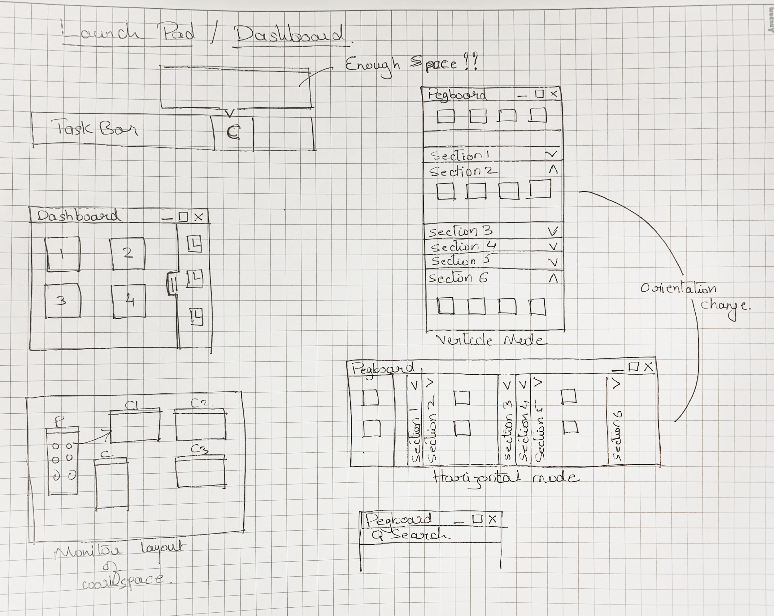
The challenge was: "From where do we launch these items !?"
In the desktop application, the entire window provides a playground. But in Web there has to be a launch pad from where new components can be launched.
Some initial thoughts were to have a try from where users could launch items. Or a Pegboard of sorts.
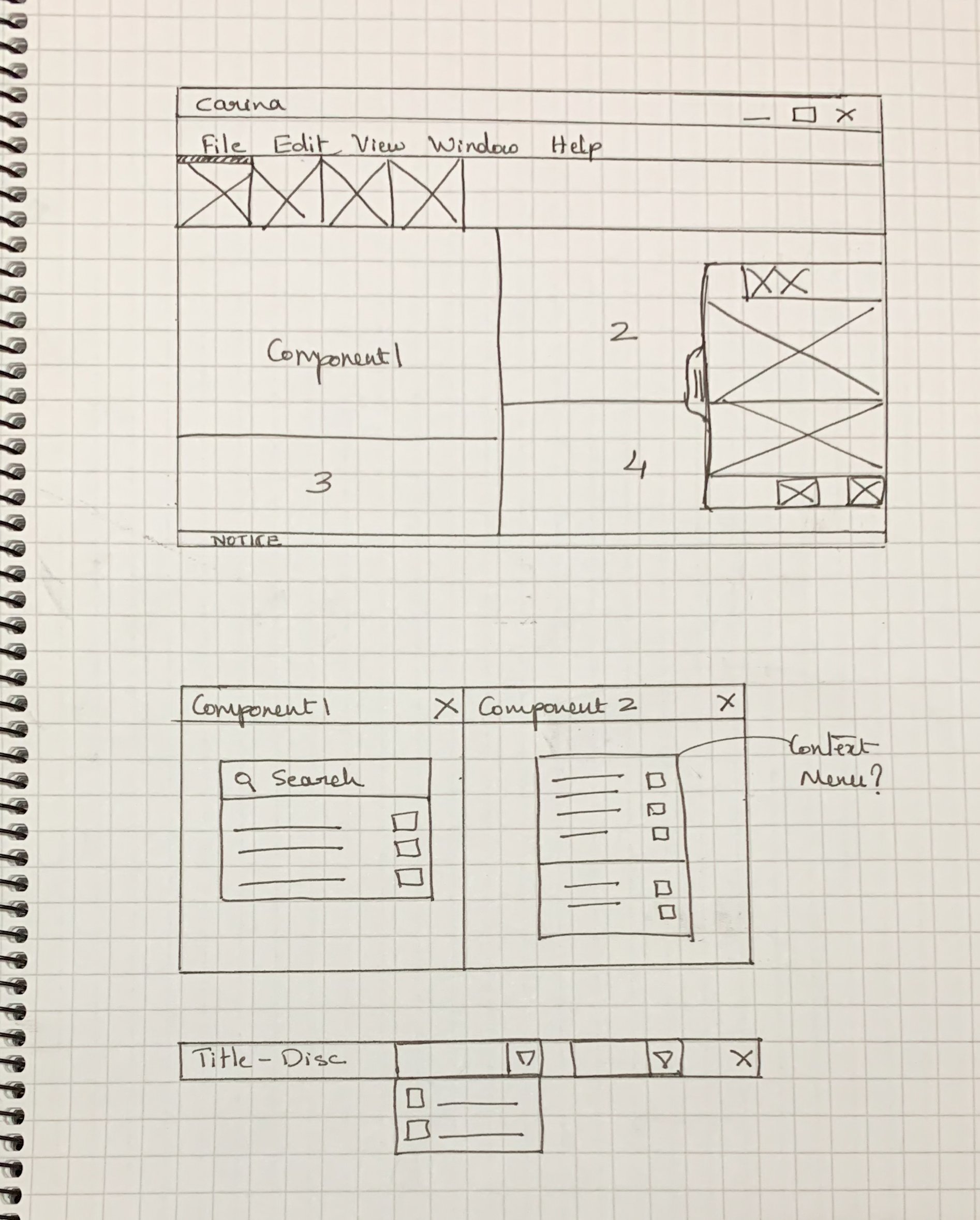
Some sketches of the new design:
Converting to basic wireframe:


Final Design
The final design provides a pegboard by default on launch. Users can see their components divided in sections. They can search for components and even add components to favorite section.
Every component button itself provides a small dropdown, displaying a list of variations on that component.


Some Background
Wells Fargo is one of the top banks of the USA and they have a user base of millions. They are a financial institution and a large part of their banking operations is trading.
As part of a design overhaul a new trading platform was being designed and developed and I was hired as a UX designer to aid in this process.
Some major hurdles in the project:
A challenging deadline. The team was given one month to come up with a solution.
Demographical issues. All the traders, our primary users are in the US. Not possible to meet them personally.
Existing solution. A product was already in use and that posed some interesting problems.
Ideating - Rapid prototyping
Due to the time constraints, I came up with some ideas which were quickly converted to prototypes which helped me understand the challenges and what users wanted from the solution.